


Telsim
Telsim Mobile-First Transformation
Mobile-first corporate web platform for a telecom operator; mobile traffic and user experience optimization.
40%
Mobile traffic growth
2.1s
Load time
Başarı hikayesini oku →

Mobile-Responsive Design
We make your website work flawlessly on every device. Mobile-first responsive design, speed optimization, and touch-friendly interfaces turn mobile traffic into conversions.
70%+
Average mobile traffic share
500+
Completed projects
15+
Years of agency experience
2s
Target load time
Most web traffic in Turkey comes from smartphones. Google evaluates sites primarily by their mobile version with mobile-first indexing; poor mobile experience hurts both SEO and conversion.
Mizemedia treats mobile-responsive design holistically — not just shrinking the screen — with mobile-first UX, touch ergonomics, speed optimization, and Core Web Vitals targets. Responsive grids, flexible images, and device-specific interaction design are standard.
Mobile-first web platforms for Telsim, Anatolia Otel, Kenton, and dozens of brands delivered measurable results in mobile traffic growth, lower bounce rates, and higher conversion.

End-to-end mobile web solutions from responsive design to PWA, performance optimization, and mobile UX.
Fully compatible interfaces with flexible grids, breakpoints, and fluid layout for desktop, tablet, and phone.
View details →

Mobile experience designed first, then extended to larger screens; thumb-zone and touch target optimization.
View details →

Improve LCP, FID/INP, and CLS metrics for Google PageSpeed and user experience targets.
View details →
Add to home screen, offline access, push notifications, and app-like mobile experience.
View details →

Mobile cart, one-click checkout, touch-friendly product discovery, and mobile conversion funnel design.
View details →

Real device testing, Google Mobile-Friendly Test, cross-browser QA, and accessibility checks.
View details →
Mobile-First
The old "desktop-first, then adapt for mobile" approach sidelines mobile users. Mizemedia mobile-first methodology designs the best experience on the smallest screen first, then extends to tablet and desktop.
From hamburger navigation to swipe gestures, form fields to CTA button sizes — every detail is optimized for mobile user behavior.
Performance
Mobile users abandon slow sites within seconds. Mizemedia optimizes page speed with image optimization, lazy loading, critical CSS, CDN, and modern front-end practices.
Improving Google Core Web Vitals scores directly affects SEO rankings, user satisfaction, and conversion rates.
Mobile-first approaches we apply across project types.
Mobile-first corporate showcase, service pages, and contact forms.
Mobile cart, product discovery, checkout, and payment flow optimization.
Fast-loading, single-CTA mobile landing for ad traffic.
Mobile booking experience for hotels, restaurants, and appointments.
Mobile-accessible product catalog and quote portal for field teams and dealers.
Native app alternative with add-to-home-screen and offline access.
A 360° agency managing UI/UX, web development, and SEO under one roof.
Mobile design planned aligned with your website, SEO strategy, and digital marketing campaigns.
Mobile experience is designed first; desktop is extended, not deprioritized.
Optimized together for Google mobile-first indexing and Core Web Vitals targets.
Mobile conversion growth through touch-friendly CTAs, forms, and checkout flows.
Comprehensive QA on iPhone, Android, tablets, and different browsers.
Tracking mobile traffic, bounce rate, PageSpeed score, and conversion metrics.
Process
Transparent development methodology from analysis to launch.
01
Current site mobile analysis, PageSpeed, UX issues, and competitor benchmark.
02
Wireframes, responsive mockups, prototype, and stakeholder approval.
03
Breakpoint implementation, performance optimization, and cross-device QA.
04
Real device testing, Google Mobile-Friendly validation, and go-live.
Portföy
Examples from responsive web, mobile-first UX, and performance optimization projects.
ResponsiveMobile-first responsive corporate web design
Cross-DeviceConsistent mobile experience on all devices
CorporateTelsim — mobile-first corporate web transformation
E-CommerceMobile cart and checkout optimization
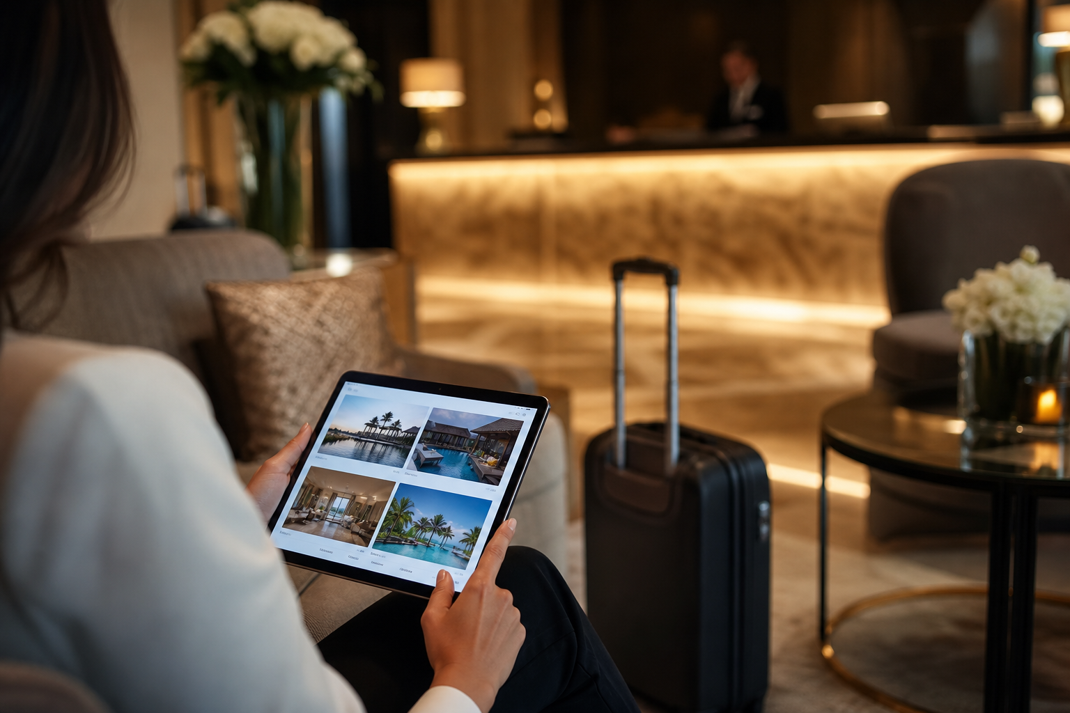 Tourism
Anatolia Otel — mobile-first booking experience
UXTouch-friendly navigation and form design
Success Stories
Mobile-first yaklaşımla mobil trafik ve dönüşüm artışı sağladığımız çalışmalar.
Telsim
Mobile-first corporate web platform for a telecom operator; mobile traffic and user experience optimization.
40%
Mobile traffic growth
2.1s
Load time
Başarı hikayesini oku →

Anatolia Otel
Mobile-first reservation flow for a boutique hotel; measurable increase in direct booking conversion.
85%
Booking growth
4.8
UX score
Başarı hikayesini oku →
FAQ
Answers about timelines, pricing, technology choices, and ongoing support.
Mobile audit, mobile-first wireframes/mockups, responsive front-end development, image optimization, Core Web Vitals improvement, cross-device QA, and Google Mobile-Friendly validation are standard scope. PWA, mobile e-commerce optimization, and accessibility modules can be added as needed.
Testimonials
Feedback from long-term partnerships.

Aslı Gündoğan
Mizemedia client
“We had Mizemedia build our website and they did an excellent job. Wishing you continued success.”

Fikret Güleç
Mizemedia client
“We receive full-service media support and implement innovations ahead of our competitors.”

Yılmaz Öztürk
Mizemedia client
“Our social media accounts are truly in the hands of professionals.”

Faruk Kara
Mizemedia client
“We partnered with Mizemedia for content management and achieved strong SEO results.”
Services
Other solutions you may want to consider alongside this page.
Other pages on Mizemedia that can support your digital growth.
Tell us your goals and we'll build a tailored digital growth plan.